Free sample lesson · Build a Design System with Claude Design
Decisions You Make Once
Why does changing one heading style ripple across fifty screens?
Lesson 1 of the Wondering course Build a Design System with Claude Design
Decisions You Make Once
Why does changing one heading style ripple across fifty screens? Because that style was never decided fifty times. It was decided once.
A design system is a set of decisions you make once. Every screen built with it reuses them.
It has three layers. Foundations are the base decisions. Components package them into reusable parts. Pages are assembled from components.
- Pages: Assembled from components.
- Components: Package foundations into reusable parts.
- Foundations: The base decisions every screen inherits.
Each layer is built from the one below it.
So a page built on a design system inherits its decisions. It does not invent its own.
Foundations: The Base Decisions
Foundations are the smallest, most widely shared choices in the system.
There are five common kinds: color roles, a type scale, spacing steps, corner radii, and an icon style.
You already know tokens are named values for design decisions. Many foundations live as tokens, such as Fern's body text size of 15 pixels.
Because type and color show up on every screen, a foundation decision is one of the most far-reaching choices you make.
Components Carry Foundations
Components are reusable parts like buttons, cards, and inputs. Each one packages several foundation decisions.
Take Fern, a plant-care app for first-time apartment gardeners. Its button uses the brand's primary color, the body type size, and the standard corner radius.
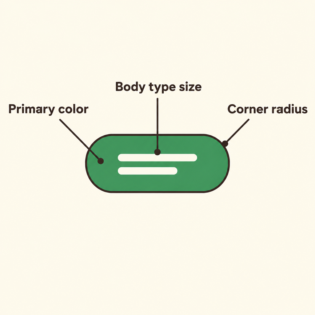
Notice that the color, the text size, and the rounded corners each trace back to a separate foundation, all inside one button.
That one button carries three foundation decisions at once.
The button does not own those values. It borrows them from the foundations.
Foundation or Component?
A quick test: is it a base value, or a part you place on a screen?
A green, a text size, a standard radius, a spacing step: those are foundations. You never drop a color onto a page by itself.
A button, a card, an input field: those are components. They are built from foundations and placed into pages.
- Foundations
- Components
Watch for one trap. A style guide document or a sticker sheet of components is not the whole system. The system is the reusable decisions underneath.
How a Foundation Change Travels
Components inherit foundations. Pages inherit components. So a foundation change flows down through both.
Say Fern switches its primary color from a dull green to a richer green. Buttons, links, focus rings, and highlights update on every page at once.
- Primary color change: Dull green to richer green
- Buttons: Updated on every page
- Links: Updated on every page
- Focus rings: Updated on every page
- Highlights: Updated on every page
Or change the body text size from 15 to 16 pixels. Text grows in cards, lists, forms, and onboarding together.
To trace a change, ask: which components use this foundation, and which pages use those components?
Where You Edit Sets the Reach
Not every edit travels as far.
Change the padding of one tip card variant, and only screens that show tips change. The rest of the app stays the same.
Editing a single page reaches even less. It changes that page and nothing else, so restyling an app page by page is slow and easy to get inconsistent.
- Foundation
- Component variant
- Single page
Pick the level that matches your intent: foundation for everywhere, component variant for its screens, page for one screen.
The System Sets the Ceiling
When an AI tool such as Claude Code, Cursor, or Claude Design generates a page from your system, it applies those decisions automatically.
That means the system's quality sets a ceiling on every page made from it.
A system is not finished because it looks good in a preview. It is judged by how well new pages turn out.
A folder of nice screenshots is not a system unless its decisions can be reused to build new screens consistently.
Check yourself
Is a button a component in a design system?
- Yes
- No
Answer: Yes
Yes. A button is a reusable part placed on pages. Color roles, text sizes, and spacing steps are foundations that buttons use.
In a design system, the base decisions are _____, reusable parts package them as _____, and screens assembled from those parts are _____.
Answer: In a design system, the base decisions are foundations, reusable parts package them as components, and screens assembled from those parts are pages.
Foundations provide the base decisions. Components package those decisions into reusable parts, and pages are assembled from components.
A product team changes its primary color foundation. Which result is most likely?
- Buttons and links update across every page that uses them
- Only the page edited most recently changes
- Only the color token changes, not interface elements
- Every component variant changes, even if it does not use that color
Answer: Buttons and links update across every page that uses them
Components inherit foundations, and pages inherit components. Therefore, every page using affected buttons, links, focus rings, or highlights can update together.
Keep going
This is lesson 1 of 4 in Build a Design System with Claude Design. Next up:
- A Brief a Tool Can Design From
- Review What Cascades
- Iterate by Pointing, Not Re-Prompting
Wondering turns any topic into short lessons you can read, watch, or listen to, with practice questions and an AI tutor.