Free sample lesson · Brainstorm Past the Obvious with AI
AI's First Answer Is Everyone's
Why do three weather-app prompts return the same big temperature number?
Lesson 1 of the Wondering course Brainstorm Past the Obvious with AI
Three Prompts, One Weather App
Ask an AI tool to design a weather app. Then ask again in a fresh chat. Then have a colleague try it too.
You will likely get three screens with a city name, a huge temperature, an hourly strip, and a weekly row of icons.
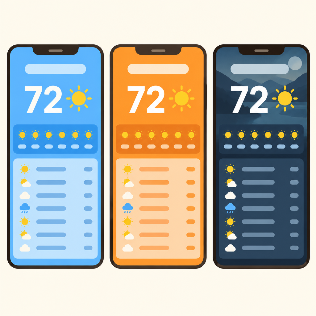
Notice that the city name, big temperature, hourly strip, and weekly row sit in the same places on all three screens; only the colors change.
The colors differ. Maybe the background photo changes. Underneath, it is the same skeleton in different outfits.
This lesson explains why that happens and what you should do about it.
Why Outputs Land in the Middle
AI models are trained on a huge sea of existing interfaces. When you prompt one, it predicts the likeliest output.
For a common request like a weather app, the likeliest output is the most common pattern in that training data.
- Training: The model learns from a huge sea of existing interfaces.
- Your prompt: You make a common request, like a weather app.
- Prediction: The model predicts the likeliest output.
- Common pattern: The likeliest output is the most common pattern it has seen.
- Same result: Anyone with a similar prompt lands on a near-identical design.
We call this the statistical middle: clean, competent, and interchangeable.
That is why results look polished and similar at the same time. Anyone with a similar prompt lands in the same place.
Regenerating Is Not Rethinking
A common belief: hit regenerate a few times and you will get genuinely different ideas.
In practice, regenerating samples nearby options. Colors, spacing, and icons shift. The structure rarely changes.
The model is capable of unusual ideas in general.
- Regenerate
- Rule out the default
It mostly produces them when your prompt makes the common answer unavailable, so the safe middle is off the table.
Spotting the Same Skeleton
To judge a set of AI designs, separate the skeleton from the outfit.
The skeleton is the structure: which elements appear and how they are arranged. The outfit is the surface: palette, background photo, styling.
- Skeleton
- City name: Sits at the top in nearly every version.
- Huge temperature: The dominant element on the screen.
- Hourly strip: A horizontal row of upcoming hours.
- Weekly row of icons: A list of days with condition icons.
- Outfit
- Palette: Changes the mood, not the idea.
- Background photo: Swappable without altering the structure.
Same skeleton plus a new outfit still equals the same design idea.
If you could swap the palettes between designs and nothing important changes, you are looking at one idea three times.
Check the skeleton first. That is where real difference lives.
The Obvious Tier Is Free
A clean, generic weather screen once took a designer a day. Now it takes one prompt.
That is exactly why it no longer stands out. Everyone gets the same competent default, instantly.
Polished does not mean distinctive. A good-looking output can still be the same screen your competitors will ship.
Treat the default as a baseline: it shows you what everyone else will ship. Your value moves to going past it.
When the Default Is Enough
Going past the obvious is not always needed.
For utility screens where familiarity helps, such as a settings page or checkout, the common pattern may be the right answer. Users already know how it works.
Push past the default when the product needs a distinctive identity or a fresh solution to a problem.
Before accepting the first answer, ask: does this screen need to feel familiar, or does it need to feel like ours?
- First AI output
- Familiar or ours?: Does this screen need familiarity or a distinctive identity?
- Keep common pattern: Fits utility screens like settings or checkout.
- Push past default: Needed for identity or a fresh solution.
- Familiar
- Ours
Putting It to Work
Here is how to use this in tools like Claude Code, Cursor, or Claude Design.
Expect the middle. One-shot output will match what others get from similar prompts.
Read the skeleton. Do not let a new palette fool you into seeing a new idea.
Decide the stakes. Familiar utility screens can keep the default. Identity work needs more.
Close off the obvious. Write prompts that make the common answer unavailable.
Check yourself
Three weather apps use the same city name, huge temperature, hourly strip, and weekly icon row, but different colors. Do they show three substantially different design ideas?
- Yes
- No
Answer: No
No. The shared arrangement is the skeleton, while colors and images are the outfit. Changing the outfit does not create a new underlying idea.
A common request follows this path: first _____ gives the model interface examples; then a _____ asks for a weather app; the model makes a _____; that prediction favors a _____; and similar users get a _____.
Answer: A common request follows this path: first training gives the model interface examples; then a prompt asks for a weather app; the model makes a prediction; that prediction favors a common pattern; and similar users get a same result.
The model learns from training data, receives a prompt, predicts a likely response, favors common patterns for common requests, and often gives similar users similar designs.
Why do unconstrained prompts for a weather app often produce near-identical designs?
- The model predicts the most common pattern for a common request.
- The model deliberately copies the first weather app it generated.
- Different colors automatically force the model to use the same layout.
- Regeneration removes unusual ideas from the model's training data.
Answer: The model predicts the most common pattern for a common request.
The model predicts likely outputs from many existing interfaces. For a common request, the most likely output is usually the common pattern, so similar prompts converge on similar layouts.
Keep going
This is lesson 1 of 4 in Brainstorm Past the Obvious with AI. Next up:
- Prompting for Real Divergence
- Explore One Variable at a Time
- Converge with Written Reasons
Wondering turns any topic into short lessons you can read, watch, or listen to, with practice questions and an AI tutor.