Free sample lesson · Add Motion to Your UI with AI
Motion Is Communication
Why does a cart badge that bumps tell you the item was added?
Lesson 1 of the Wondering course Add Motion to Your UI with AI
Motion Is a Message
You tap Add to cart. The little badge on the cart icon bumps. You never read a word, yet you know the item was added.
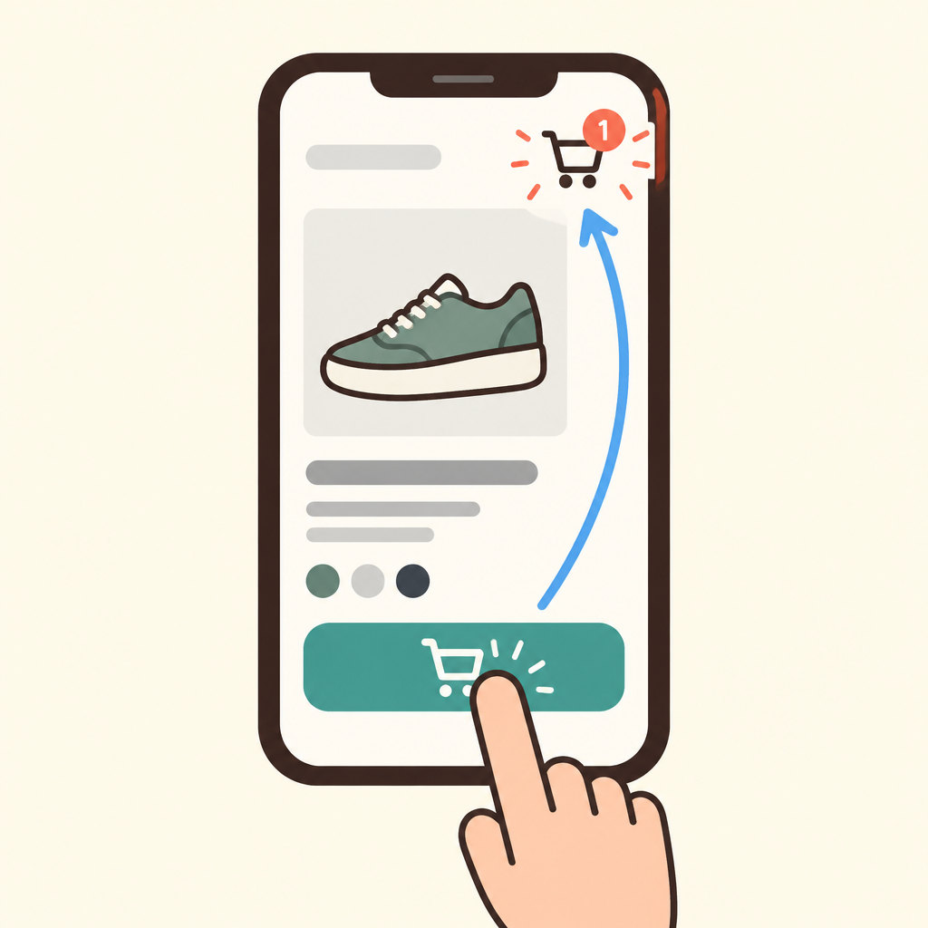
Notice how the badge moves right after the tap, which confirms the add without any words.
That bump answered a question you did not know you had: did my action register?
Good UI motion works like this. It tells the user something they need, right when they need it.
This lesson gives you one simple way to judge any animation: ask what it says.
Three Jobs Motion Can Do
Most useful motion does one of three jobs. Each job answers one user question.
Feedback answers did my action register? It is short and local, happening where the finger is, right after the action.
Continuity answers where did that come from? It connects two states, like a product card expanding into its detail page, so you never lose your place.
Hierarchy answers what matters most here? For example, a page's main content settles slightly before the secondary links.
- Feedback
- Continuity
- Hierarchy
Same Layout, Different Feel
Picture two versions of a shop app with identical layouts. One has motion. One does not.
In the animated version, the cart badge bumps on add, the product card grows into the product page, and the checkout button dips when pressed.
- Without motion
- With motion
Nothing new appears on screen.
Yet the animated app feels more responsive, because every action is acknowledged. The motion adds no new content, only answers.
When Motion Costs Attention
Many designers new to motion assume polish comes from adding animation everywhere. Shipped products use a small amount of purposeful motion and leave most of the screen still.
Some motion only costs attention: a spinner on an instant action, an icon that bounces forever, a slow transition on a screen people open fifty times a day.
This is decoration. It draws attention to itself instead of the user's task.
The same visual change can be useful or decorative. It depends on whether it answers one of the three questions.
The Cut Test
Here is the test. Ask three questions about any animation.
Did my action register? Where did that come from? What matters most?
- Proposed animation
- Confirms an action?: Did my action register?
- Shows where from?: Where did that come from?
- Shows what matters?: What matters most?
- Keep it: You can name the question it answers.
- Cut it: The screen usually feels faster.
If the animation answers none of them, removing it costs the user nothing. It usually makes the screen feel faster, too.
If it answers one, keep it. You can now name exactly why it stays.
Practice: Keep or Cut?
Try the test on real cases. A logo that spins on every page load answers no user question, so it fails.
A checkbox that ticks with a quick stroke when a to-do is done confirms the action. That is feedback, so it stays.
A product card expanding into its detail page shows they are the same object. That is continuity.
Main content settling just before the secondary links guides the eye. That is hierarchy.
Using This in Your Work
When you build with AI tools like Claude Code, Cursor, or Claude Design, animations can pile up fast. Treat each one as something to check.
For every animation, name its job: feedback, continuity, hierarchy, or decoration.
Keep the ones that answer a user question. Cut the decoration.
Then explain each choice to a colleague in one plain sentence, such as this motion tells the user their tap worked.
- Spot it: Notice each animation in your design or prototype.
- Ask: Check which of the three user questions it answers.
- Name the job: Label it feedback, continuity, hierarchy, or decoration.
- Keep or cut: Keep motion that answers a question and cut decoration.
- Explain: Justify the choice in one plain sentence.
Check yourself
A cart badge that bumps immediately after a user taps “Add to cart” is an example of feedback.
- True
- False
Answer: True
Feedback confirms that the user’s action registered. The badge moves right after the tap and acknowledges the add without requiring words.
Useful UI motion answers different questions: a cart badge bump shows _____ after an action, a product card expanding into a detail page shows _____, and main content settling before secondary links establishes _____.
Answer: Useful UI motion answers different questions: a cart badge bump shows feedback after an action, a product card expanding into a detail page shows continuity, and main content settling before secondary links establishes hierarchy.
Feedback confirms an action, continuity connects an element across two states, and hierarchy guides attention toward what matters most.
A designer adds a quick stroke animation when a user checks off a to-do item. Why should the animation usually stay?
- It confirms that the action registered.
- It makes every screen feel more polished.
- It shows where the to-do came from.
- It keeps the interface moving continuously.
Answer: It confirms that the action registered.
The stroke confirms that the checkbox action registered, so it serves feedback. It answers a user question instead of drawing attention to itself for decoration.
Keep going
This is lesson 1 of 4 in Add Motion to Your UI with AI. Next up:
- The Four Words of Motion
- Motion That Respects People and Phones
- Directing Motion with a Spec
Wondering turns any topic into short lessons you can read, watch, or listen to, with practice questions and an AI tutor.